
Design systems and components in Vorx
By The Vorx Team

The difference between a prototype and a product is often just that every screen looks like it belongs to the same app — the same spacing, the same buttons, the same voice. Vorx builds on a design system so that consistency is the default rather than something you police by hand.
Shared tokens
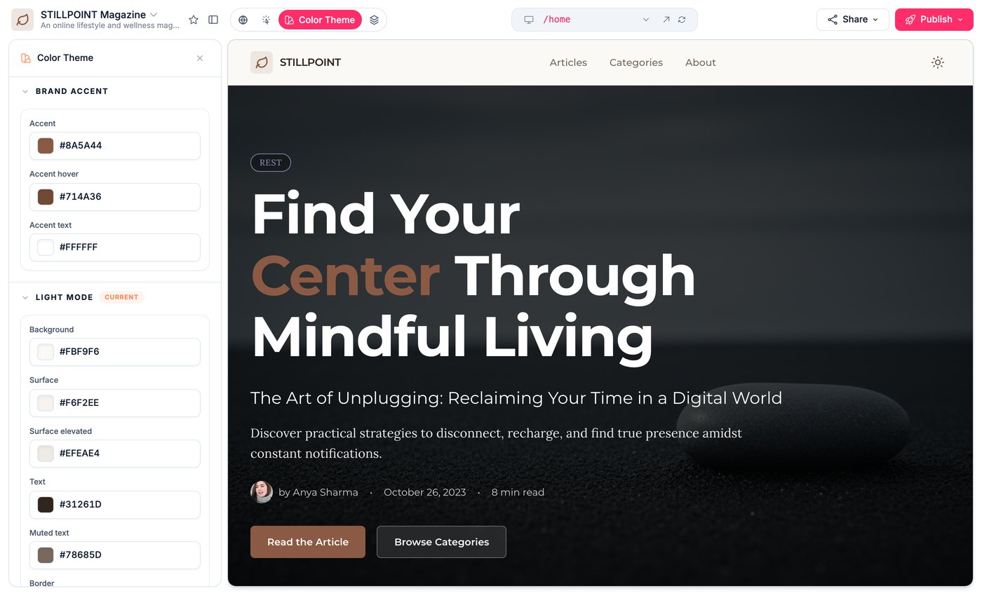
Under every Vorx app is a shared set of design tokens: the colours, spacing steps and type styles the whole interface draws from. Because screens reference the same tokens instead of one-off values, they match automatically, and a change in one place carries everywhere.
That's what keeps a ten-screen app coherent. Ask for a new page and it inherits the same palette and rhythm as the rest, so nothing looks bolted on.
Set the brand once
You don't have to accept the defaults. Describe your brand and Vorx applies it across the app in one move:
Use a deep green as the primary colour, a warm off-white background, and a rounded, friendly button style throughout.
Because that maps onto the tokens, every existing and future screen updates together — you're not restyling pages one at a time. For adjusting the palette and type without writing a prompt, the preview has a theme mode that does the same job with sliders and swatches.
Drop-in components
Common interface patterns are a prompt away, and they arrive accessible and on-brand rather than as raw markup you then have to style:
- A pricing table with tiers and a highlighted plan
- A data grid with sorting, filtering and pagination
- An onboarding flow that walks a new user through setup
- Empty states, toasts and confirmation dialogs
Ask for what you need — "Add a pricing table with three tiers" — and the component lands using the app's existing tokens, so it looks like part of the app the moment it appears.
One element, or the whole app
Two different jobs, two different tools. To change how one thing looks, switch the preview to visual mode, click it, and say what you want — the target is exact, so the edit is exact.
To change how everything looks, don't touch individual screens. Adjust the tokens, or ask in chat for the restyle, and let it propagate. Restyling screen by screen is how an app drifts out of alignment in the first place.
Stay in sync
You can shape components in chat or edit the code by hand, and the two stay in sync. Change a button's style in one place and it updates everywhere that button is used, rather than leaving a trail of inconsistent copies.
This matters more as the app grows. A design system only earns its keep when a single change ripples out correctly.
Keep it consistent as you scale
- Adjust tokens rather than styling individual screens when you want a global change
- Reuse existing components before inventing new ones
- Name your patterns — "our standard card", "the primary button" — so requests stay consistent
- Review new screens against older ones and nudge anything that has drifted
Do that and the app keeps feeling like one product however many screens you add. Pair it with naming and tone so the words stay as consistent as the pixels.
In the docs: Components and design and Visual edits.