

Building
Components and design
Keep a growing app visually consistent with shared design tokens and production-ready components you drop in from chat.
Good software should look finished. In Vorx, design is part of the build rather than a separate handoff.
Shared design tokens
Every app is built on a shared set of colour, spacing, and type tokens. Because screens draw from the same tokens, the app stays consistent as it grows — new pages match the ones that came before without extra effort.
Drop-in components
Ask for a component and Vorx generates an accessible, on-brand version as editable code:
Add a pricing table with three tiers, a monthly/annual toggle, and a highlighted Recommended plan.
Data grids, onboarding flows, empty states, forms — describe it and it lands in your project.
Restyle in place
Change the look without touching structure: "Make the app feel more premium — more whitespace, a serif heading, a calmer palette." Vorx adjusts the tokens and the affected components, so the change lands everywhere rather than on one screen.
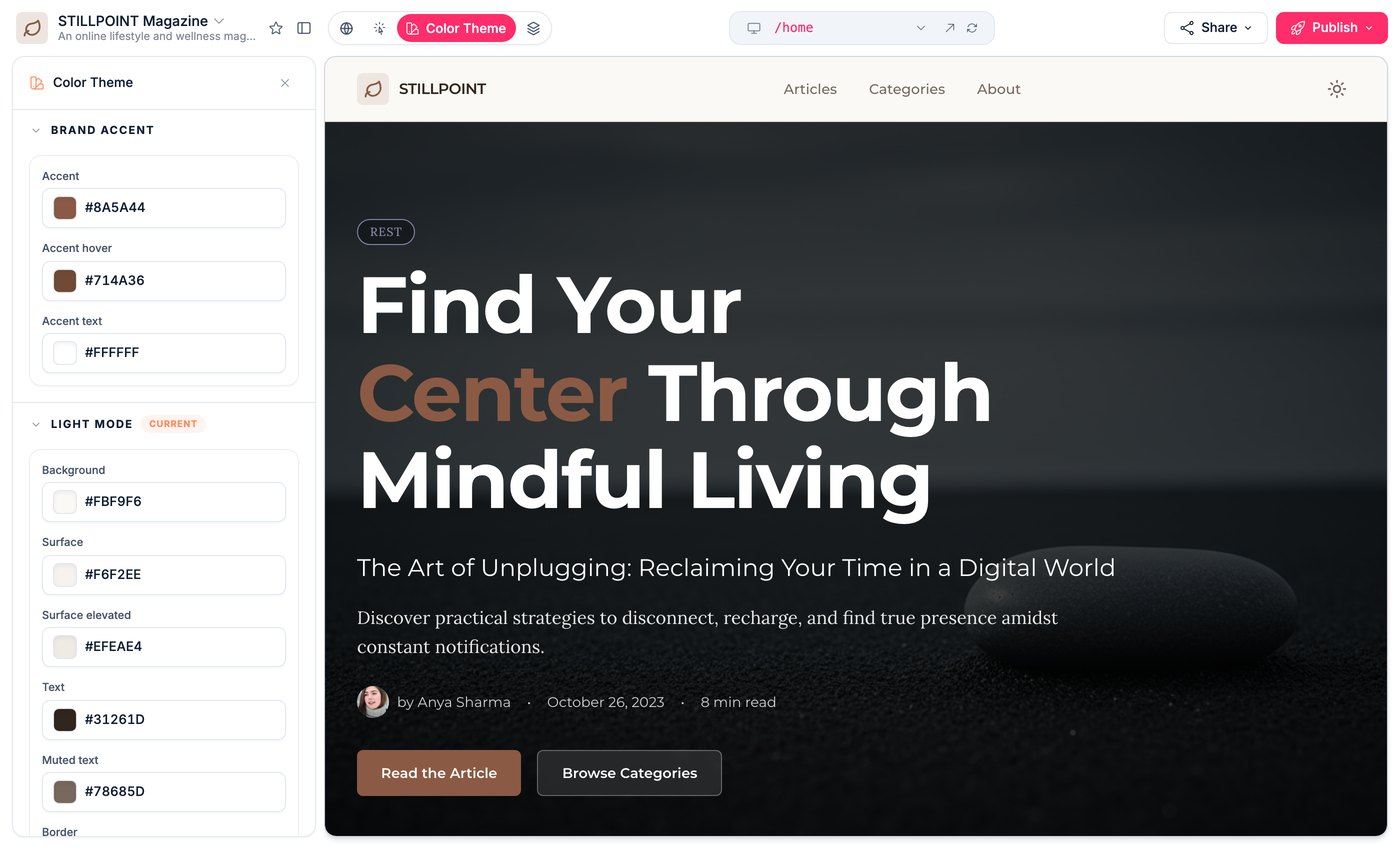
For quick adjustments to the palette and type, switch the preview to theme mode.
Match a reference
Attach a screenshot of a design you like and Vorx builds toward it. A reference image is often the fastest way to communicate a visual direction — far quicker than describing a feeling in words.
Design for the small screen too
Most people will open your app on a phone. Resize the preview, walk the main flow, and ask Vorx to fix whatever breaks at mobile width. It's much easier to do this as you go than as a pass before launch.
It's real code
Every component is generated into your codebase, so you can fine-tune it by hand and it stays in sync with future chat edits. Nothing is locked behind a builder-only format.
Next steps
- Visual edits — adjusting one element at a time
- Multi-page apps — keeping a growing app coherent
- Launch checklist — the polish pass before you ship